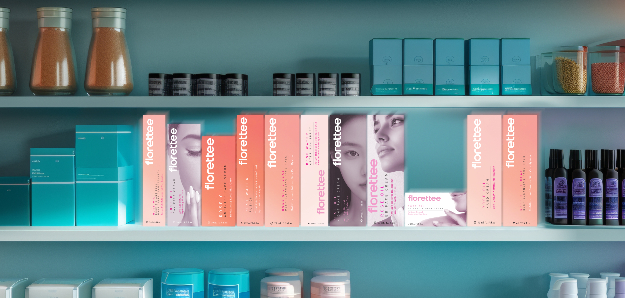
Florettee is a high-end French makeup brand renowned for its commitment to elegance, simplicity, and timeless design. Seeking to rejuvenate its corporate identity, Florettee aimed to better reflect its dedication to quality and its position in the luxury cosmetics market.
Design Approach: Minimalist Aesthetics: Emphasizing the brand’s philosophy of “less is more,” the new design features clean lines and understated elegance, allowing the craftsmanship of the products to take center stage. Sophisticated Color Palette: A refined selection of colors was chosen to convey luxury and sophistication, enhancing brand recognition and appeal. Modern Typography: Contemporary typefaces were integrated to reflect the brand’s forward-thinking approach while maintaining readability and class. Consistent Branding Elements: A unified set of branding elements, including logos, packaging, and marketing materials, was developed to ensure a consistent brand experience across all touchpoints.
The rebranding initiative successfully positioned Florettee as a modern yet timeless makeup brand, appealing to discerning customers seeking quality and elegance. The updated corporate identity aligns with the brand’s core values and enhances its presence in the competitive luxury cosmetics market.
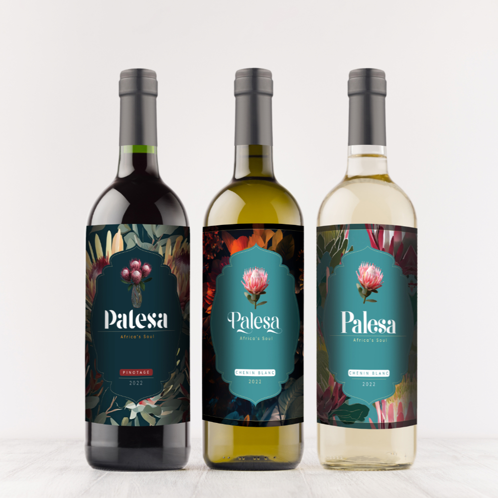
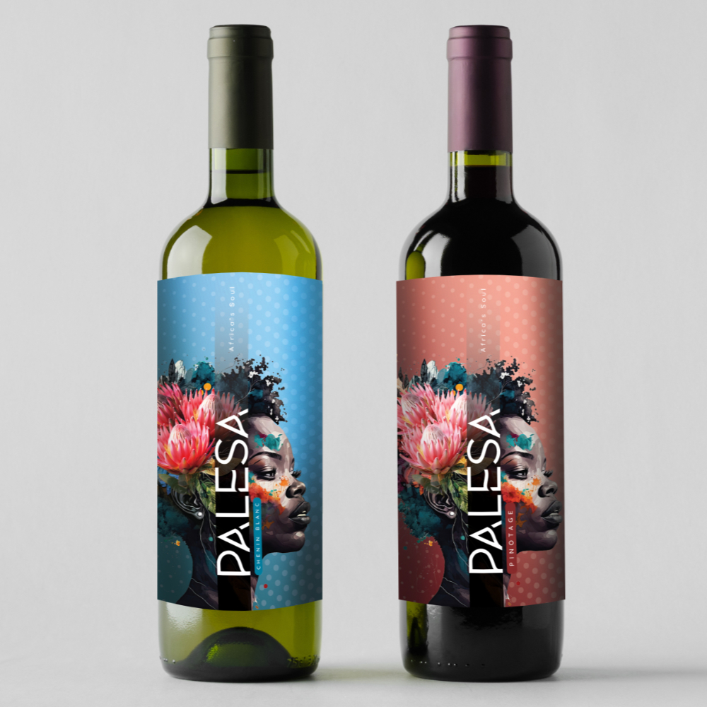
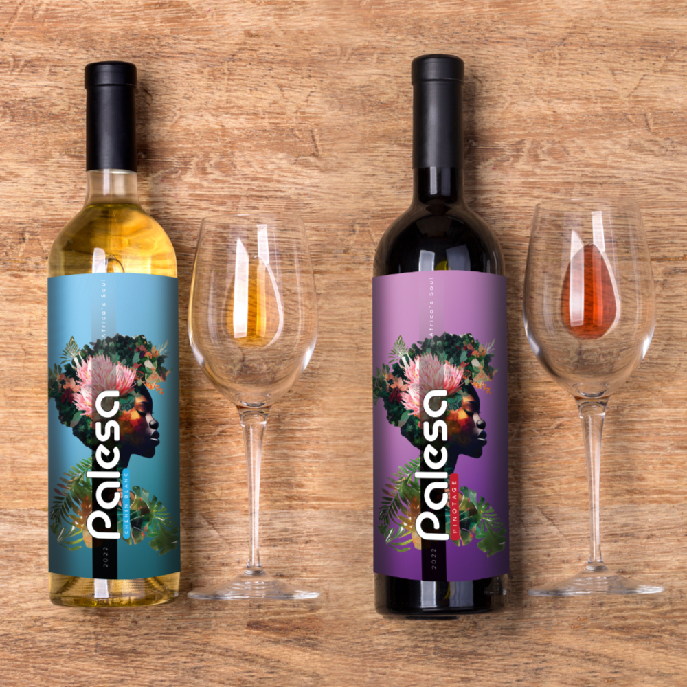
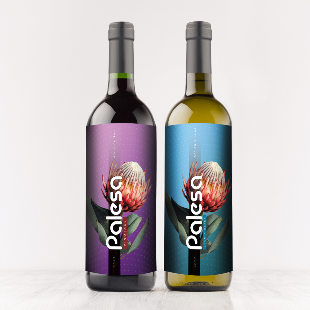
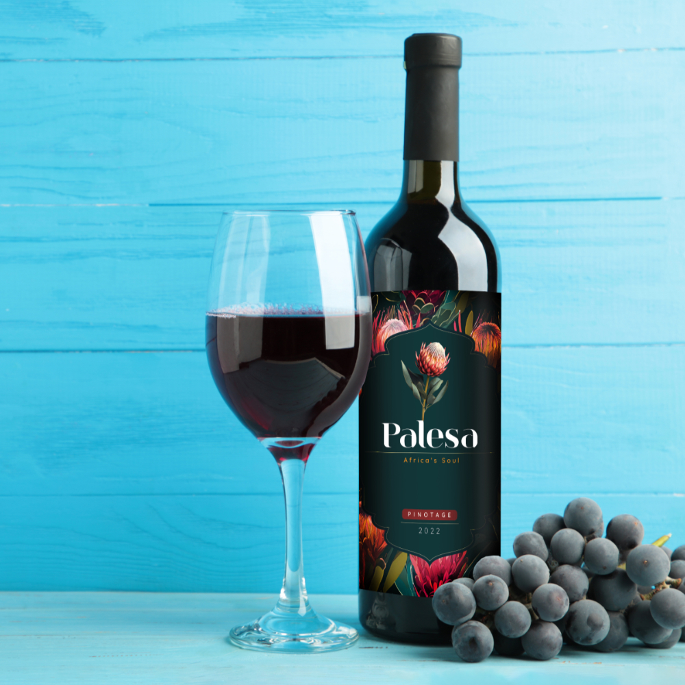
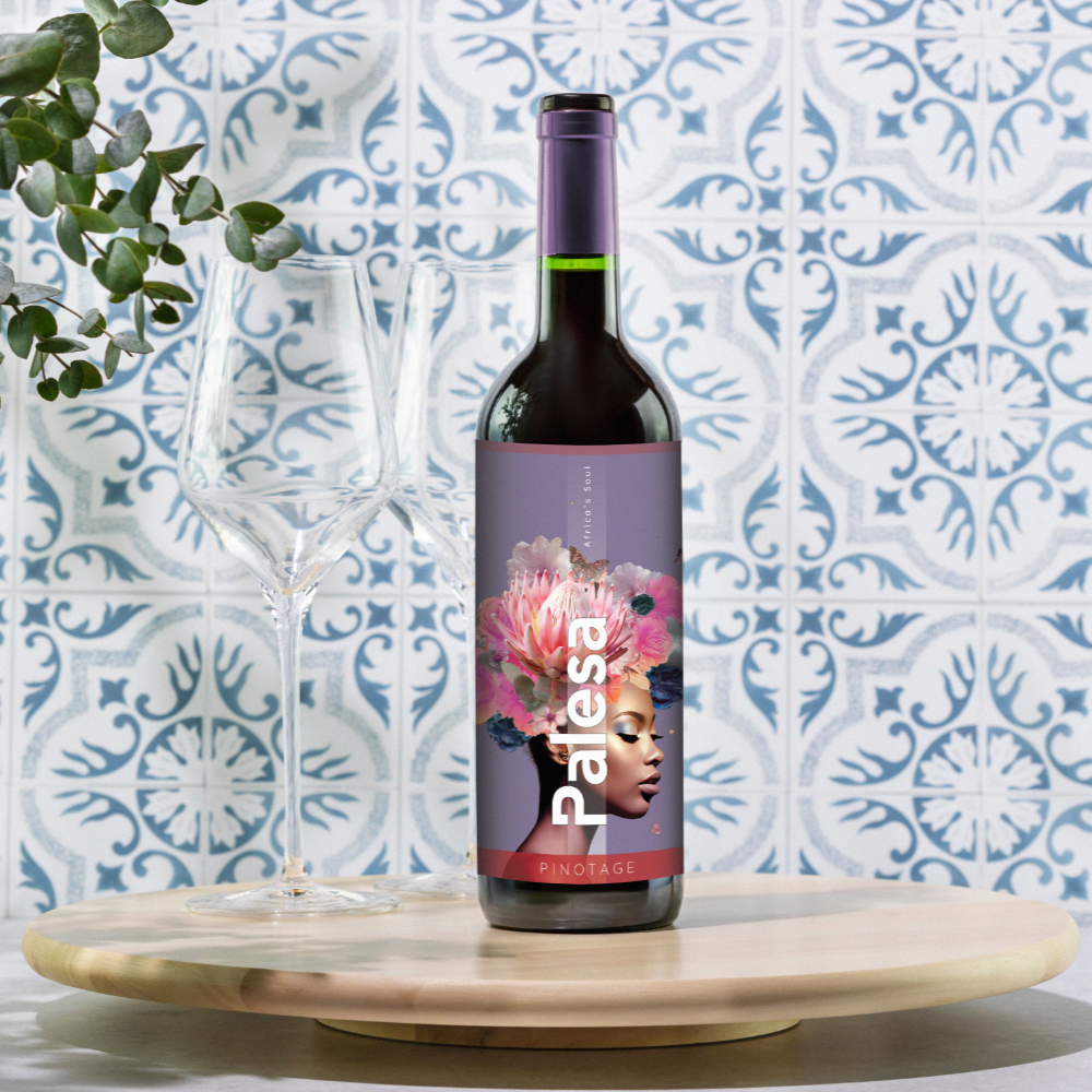
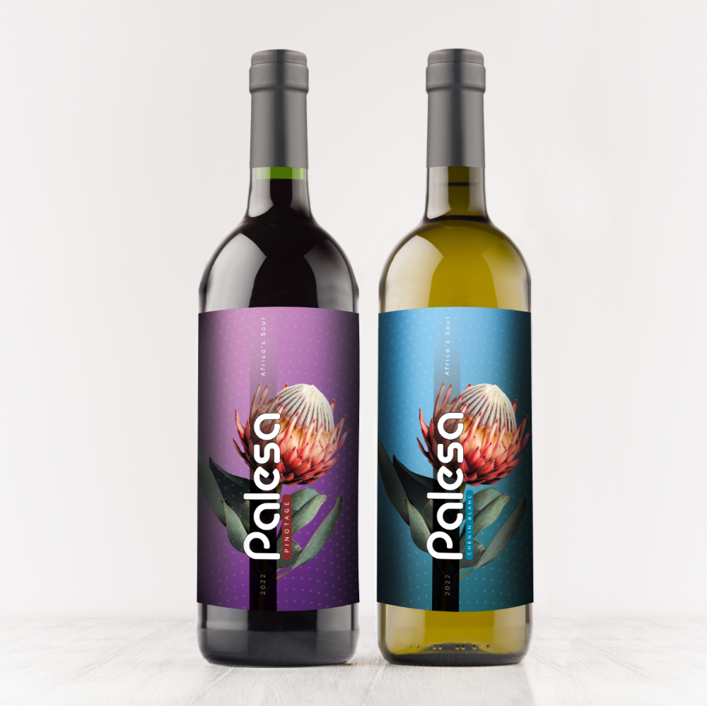
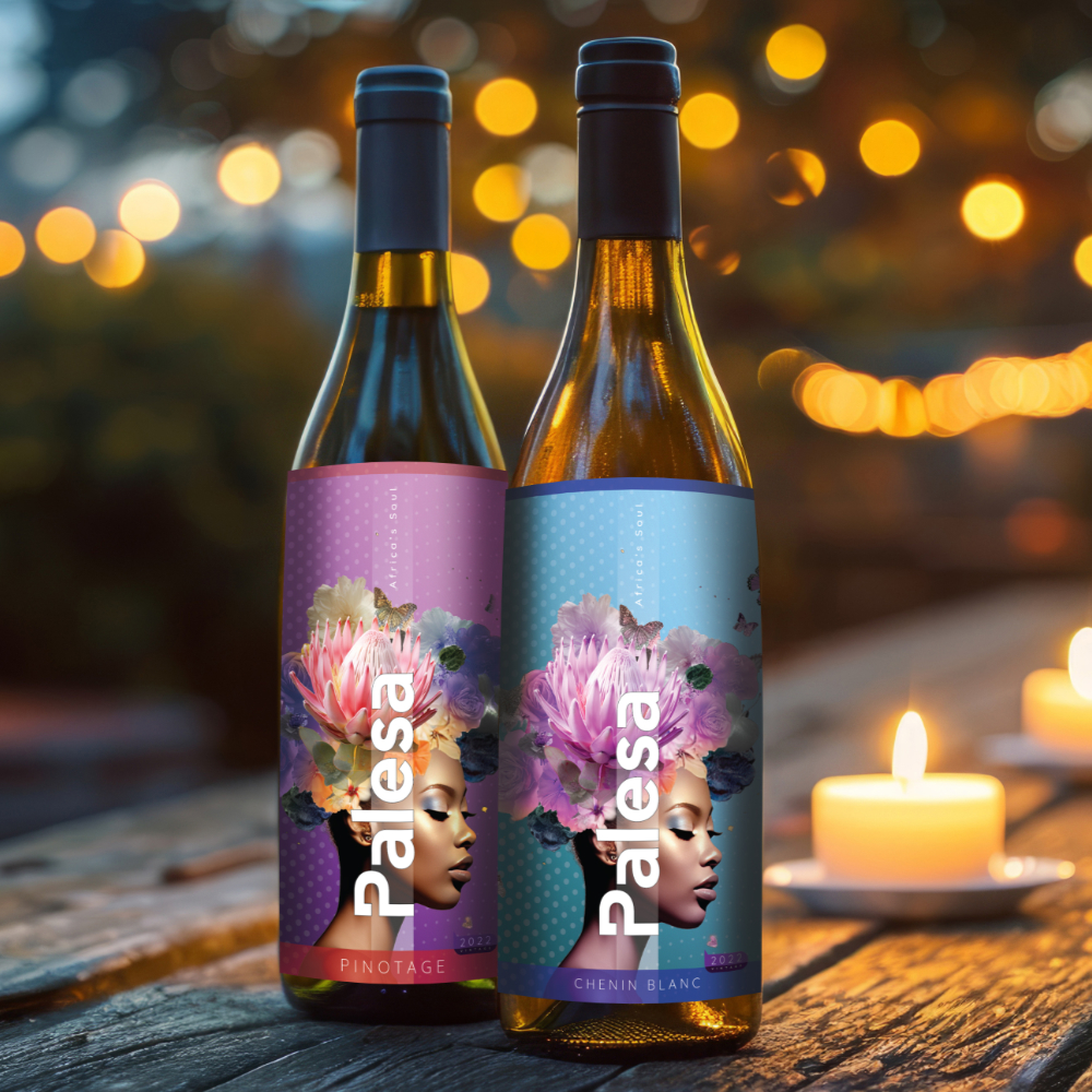
Palesa Wines
Palesa — meaning “flower” in Sesotho — is more than just a name. It symbolizes growth, resilience, and beauty rooted in the African soil. Commissioned by New Hope Wines, a proudly 51% black-owned wine company based in the fertile Breedekloof region, the Palesa Wines rebrand set out to tell a new story: one that reflects the vibrance of its heritage, the elegance of its offering, and the strength of its people.
Our goal was to reposition Palesa as a premium yet accessible South African wine label, deeply connected to local culture while appealing to global markets. Working closely with New Hope Wines — whose mission is to provide a home and platform for other black-owned brands — we crafted a new visual identity that marries sophistication with soul.
A refined, floral-inspired logo system that honours the meaning of Palesa while signaling quality and authenticity. Elegant, contemporary wine labels that distinguish each varietal, balancing aesthetic restraint with expressive African detail. A storytelling framework built around Palesa as a symbol of transformation — both for the wine itself and for the people behind it.
The result is a wine brand that stands tall — rooted in its identity, blossoming with potential. Palesa is no longer just a label; it’s a story of hope, empowerment, and the quiet power of flourishing where you’re planted.
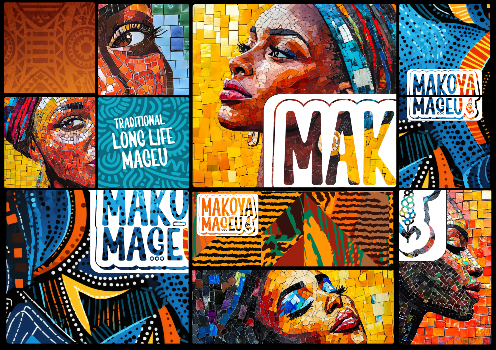
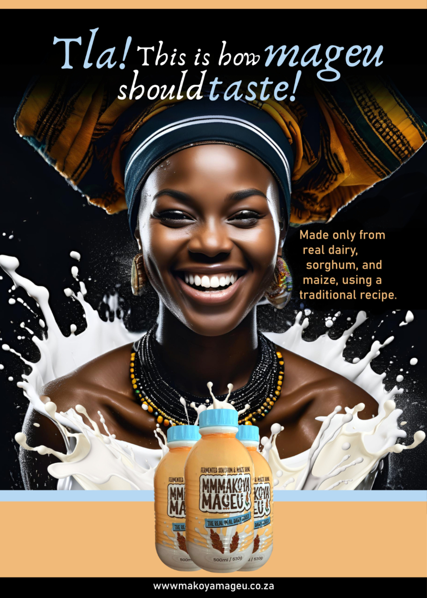
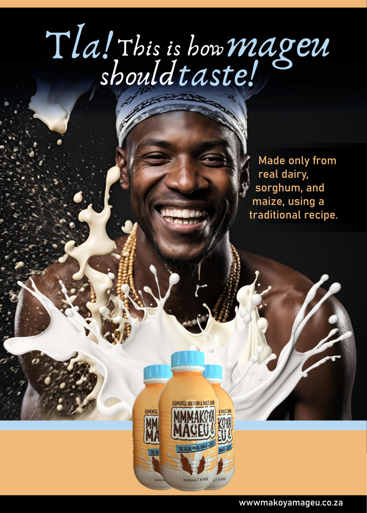
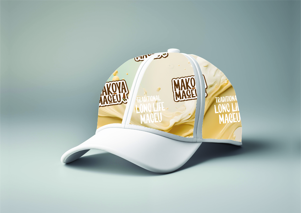
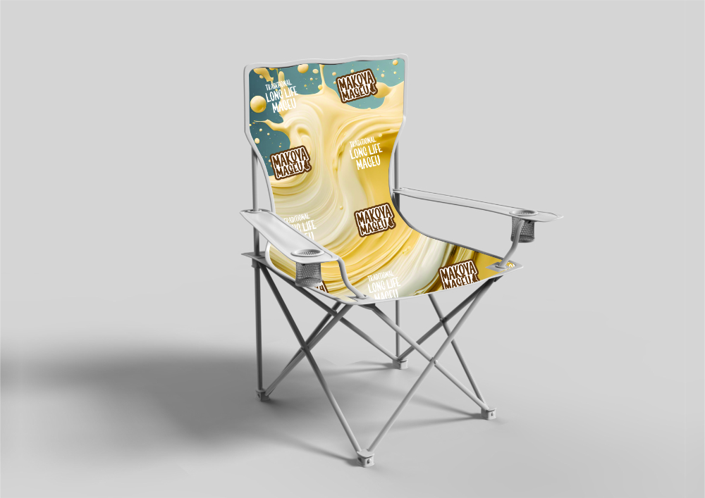
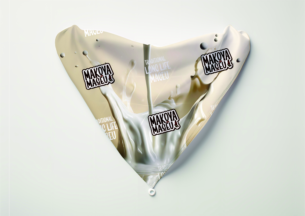
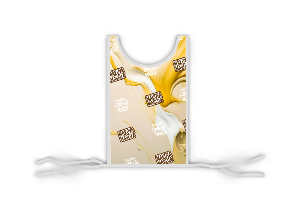
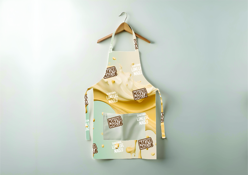
Makoya Mageu
Makoya Mageu is rooted in one of South Africa’s most beloved traditional drinks — mageu, a fermented, non-alcoholic beverage made from maize meal. Historically homemade and passed down through generations, mageu is rich in heritage, nutrition, and cultural value. But in today’s fast-moving consumer landscape, heritage brands risk getting lost unless they evolve with their audiences.
Our task was to reimagine Makoya Mageu as a brand that honours its roots while resonating with a new generation of consumers — urban, health-conscious, and visually driven. Rather than leaning into tired “ethnic” clichés, we took a bold, contemporary approach that elevates mageu as both a lifestyle drink and a cultural icon. We refreshed the Makoya brand with bold, clean typography and vibrant colour palettes that reflect flavour, freshness, and pride. The result is a striking shelf presence designed to stand out in both spaza shops and supermarket fridges.
Traditional patterns were reinterpreted in minimal, graphic forms — creating a balance between heritage and modernity. The design is instantly recognizable and proudly South African. We developed storytelling frameworks and visuals for social media, POS, and merchandising — ensuring the brand remains dynamic across platforms and touchpoints.
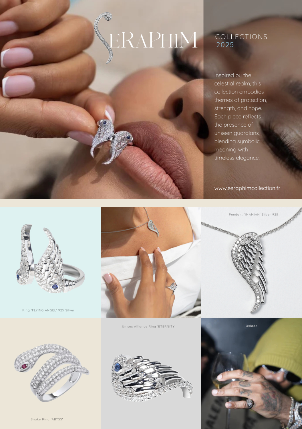
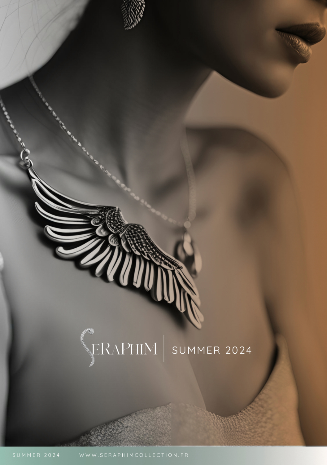
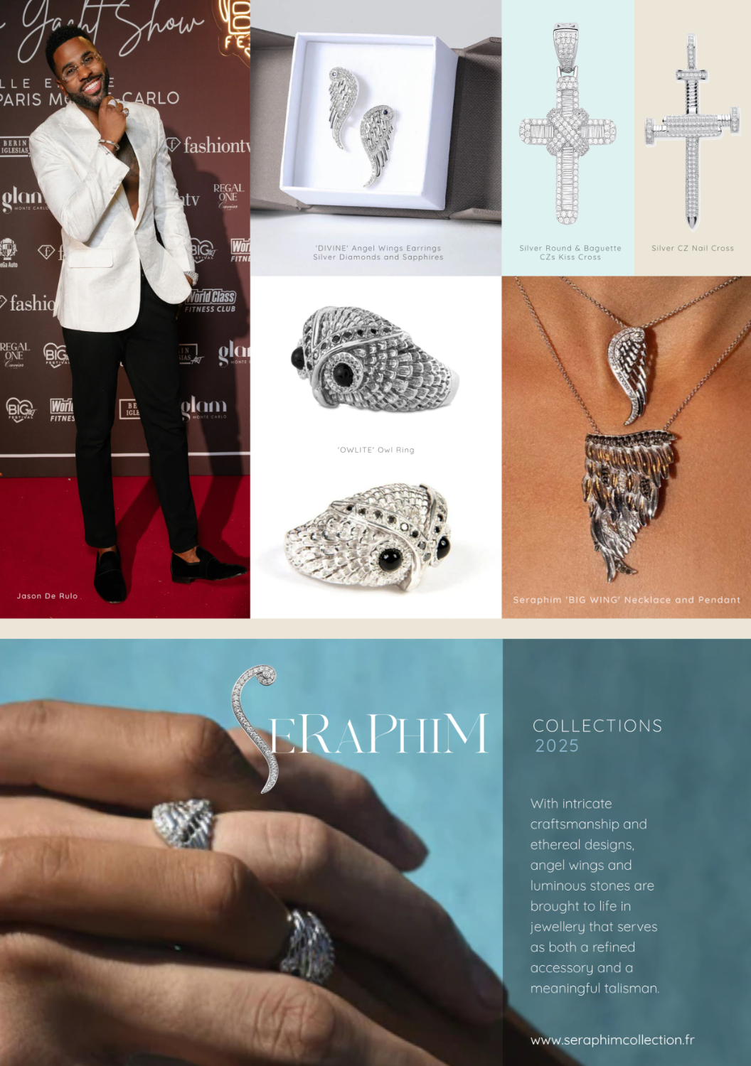
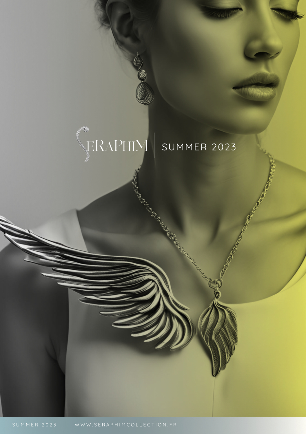
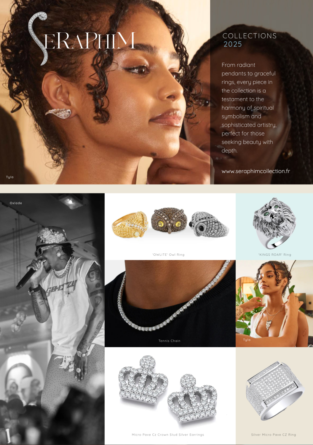
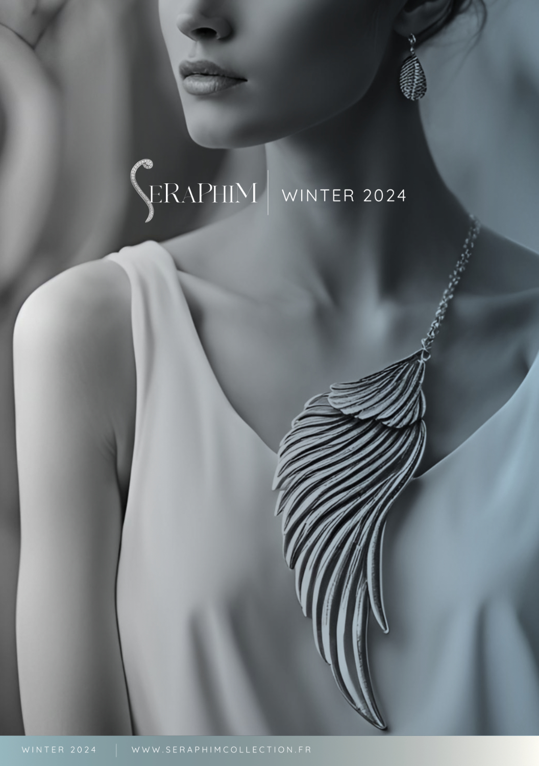
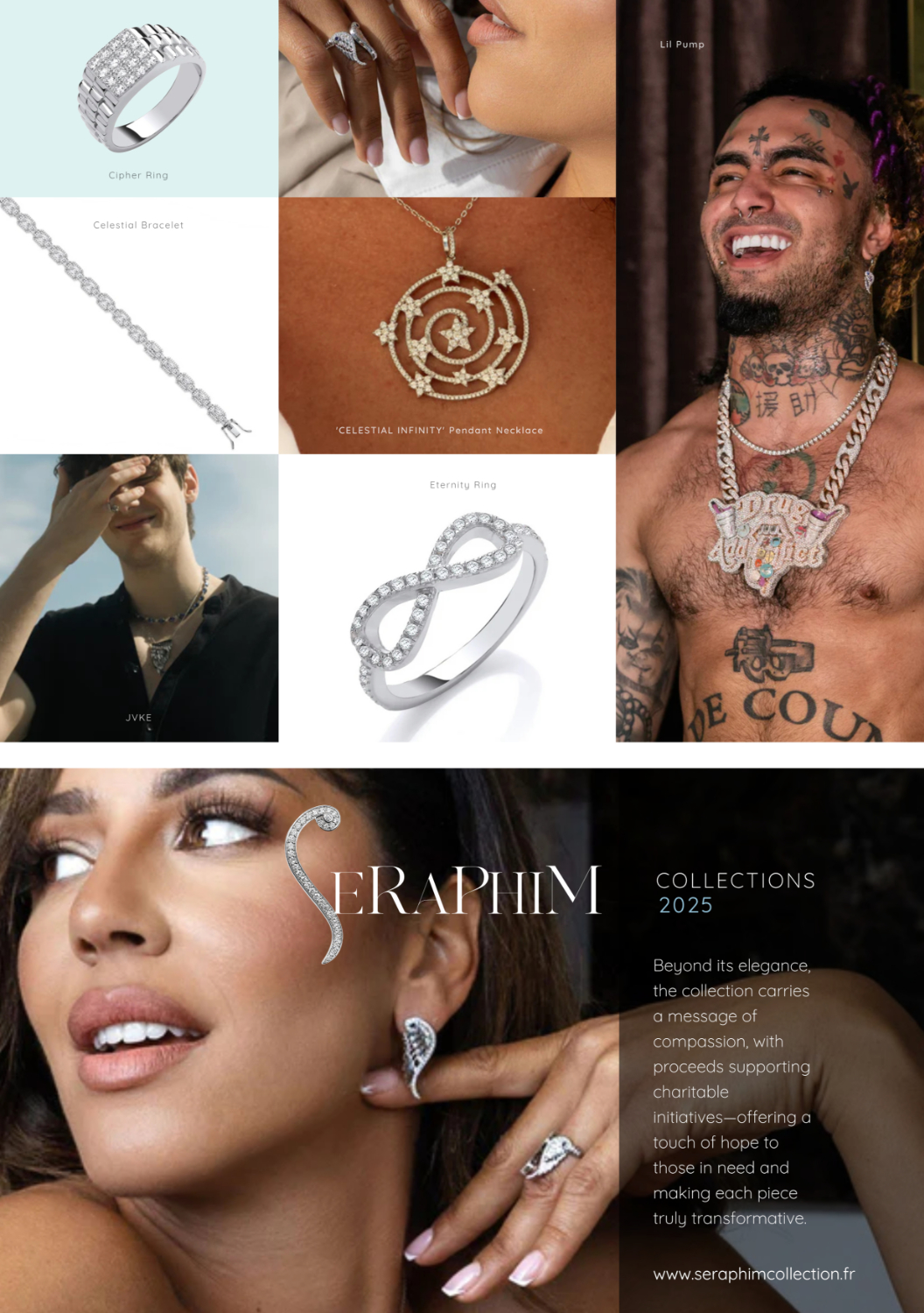
Seraphim
Seraphim is a boutique French luxury jewellery house known for its handcrafted pieces that echo purity, divine inspiration, and an enduring sense of elegance. With its name rooted in celestial symbolism — the “seraphim” angels of light — the brand evokes a spiritual approach to beauty and craftsmanship.
In 2025, Seraphim approached us with a need to realign its brand image with the next generation of clientele: sophisticated, conscious consumers seeking meaning, artistry, and authenticity in luxury.
We embarked on a comprehensive corporate identity redesign, balancing Seraphim’s rich narrative with a crisp, modern sensibility. Key pillars of the rebrand included: Celestial Minimalism: The new visual identity draws on celestial symbolism — light, purity, ascension — while remaining grounded in clean, modern forms. Timeless Typography: A bespoke typographic system that communicates high-end refinement, with soft yet confident lines. Sacred Geometry Meets Luxury: Subtle visual cues, drawn from sacred geometry and gemstone cuts, influence iconography, layout, and packaging design. Colour & Materiality: A monochromatic palette punctuated by iridescent finishes and soft metallics to reflect the ethereal, aspirational nature of the brand.
The result is a serene, luminous brand universe that positions Seraphim firmly in the premium space, allowing its pieces to speak without distraction. From packaging and collateral to digital applications and in-store elements, the new identity creates a consistent, elevated brand experience — one that speaks to the soul of luxury in a post-noise era.
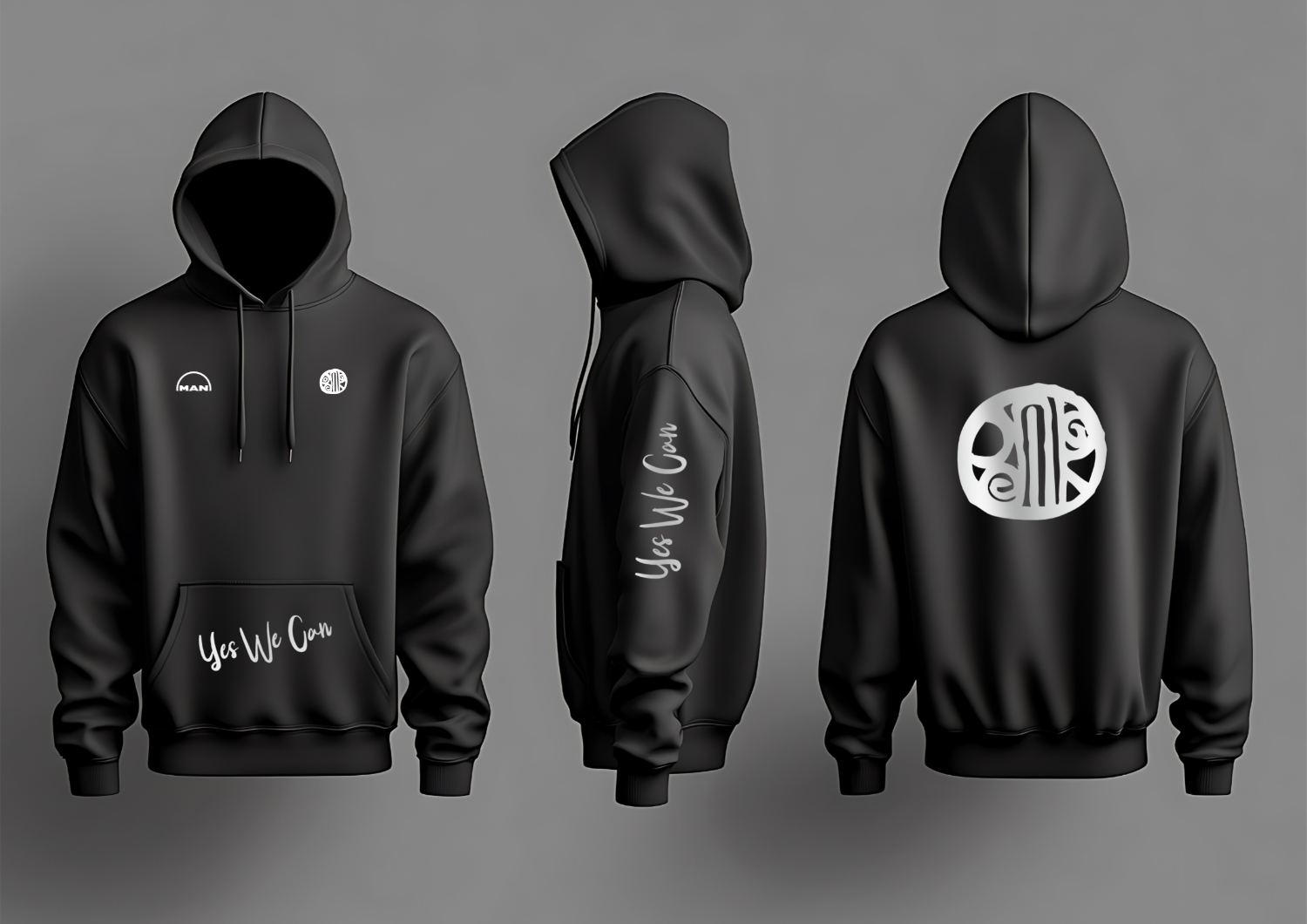
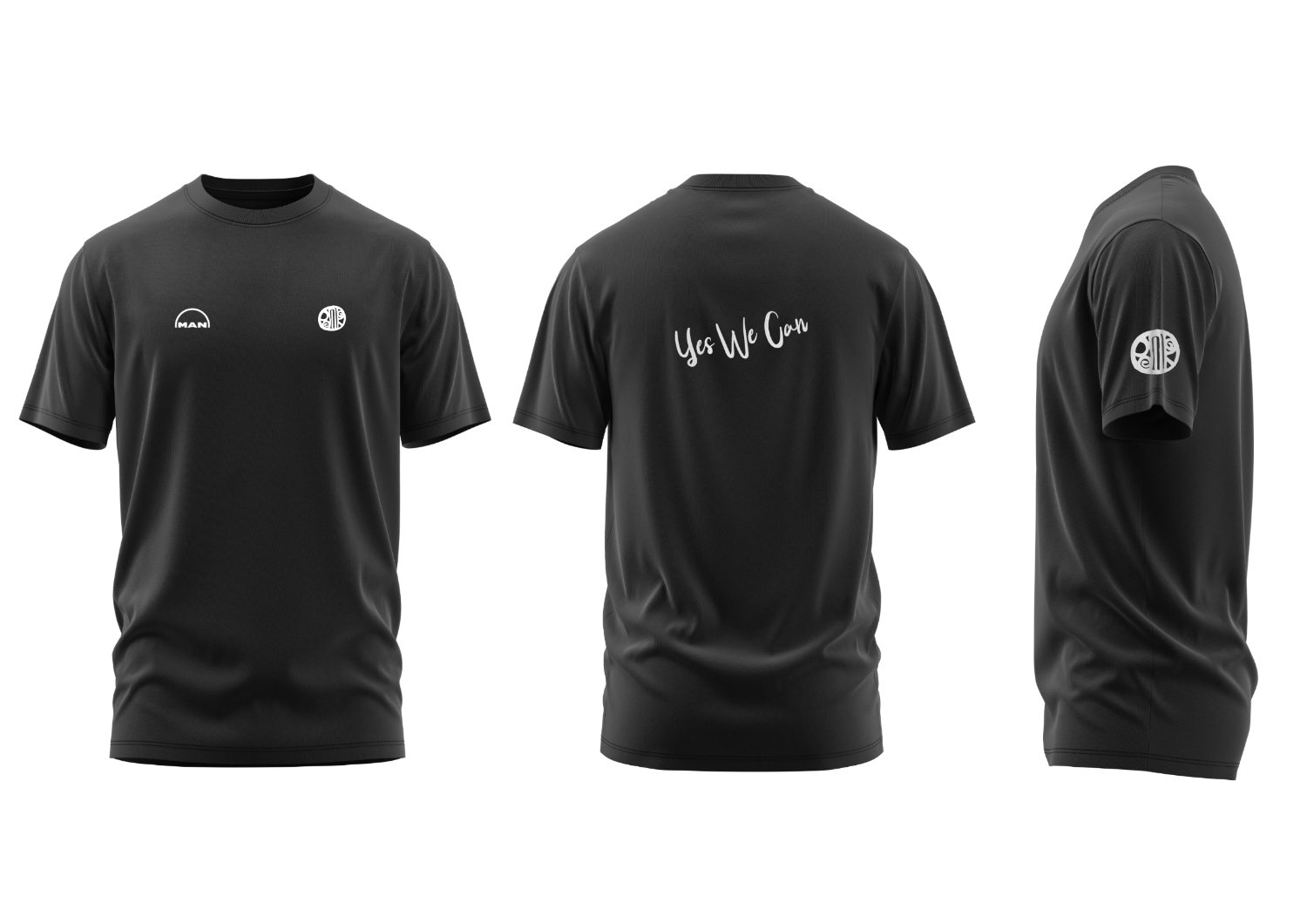
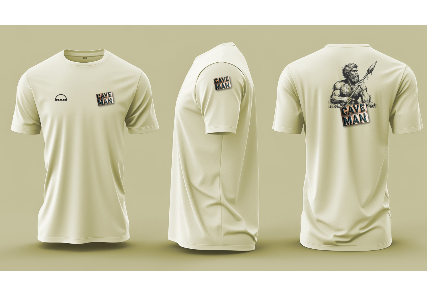
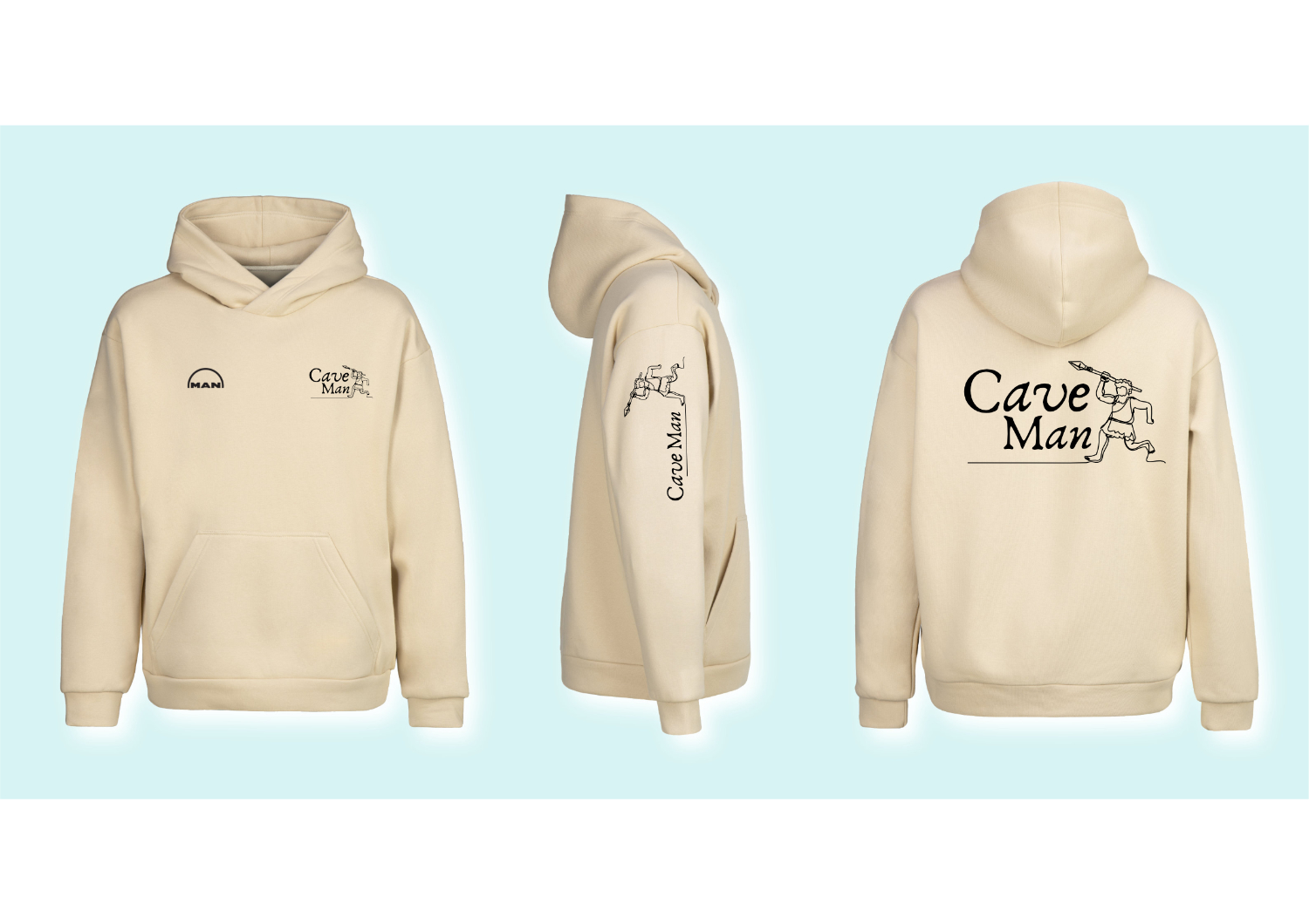
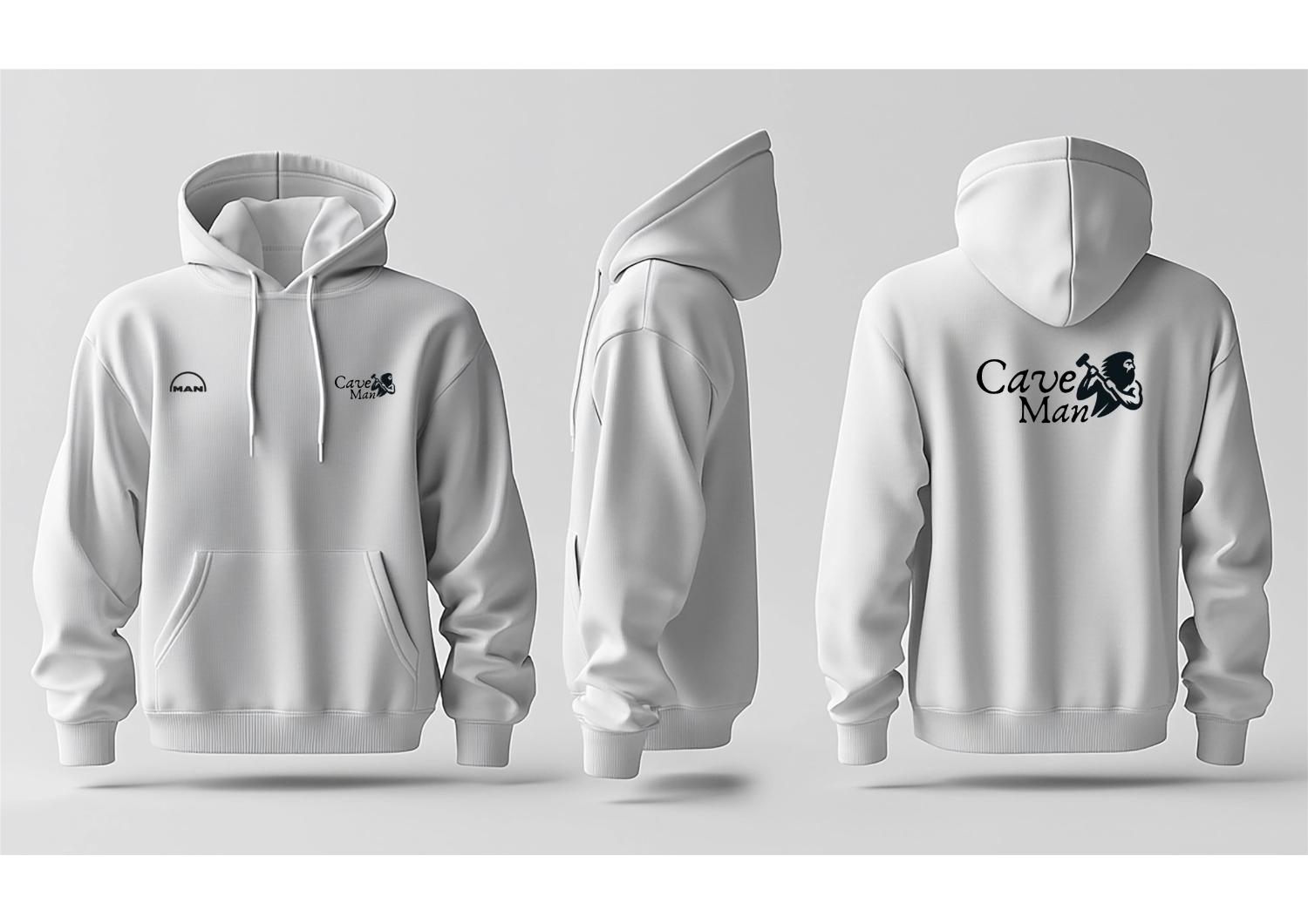
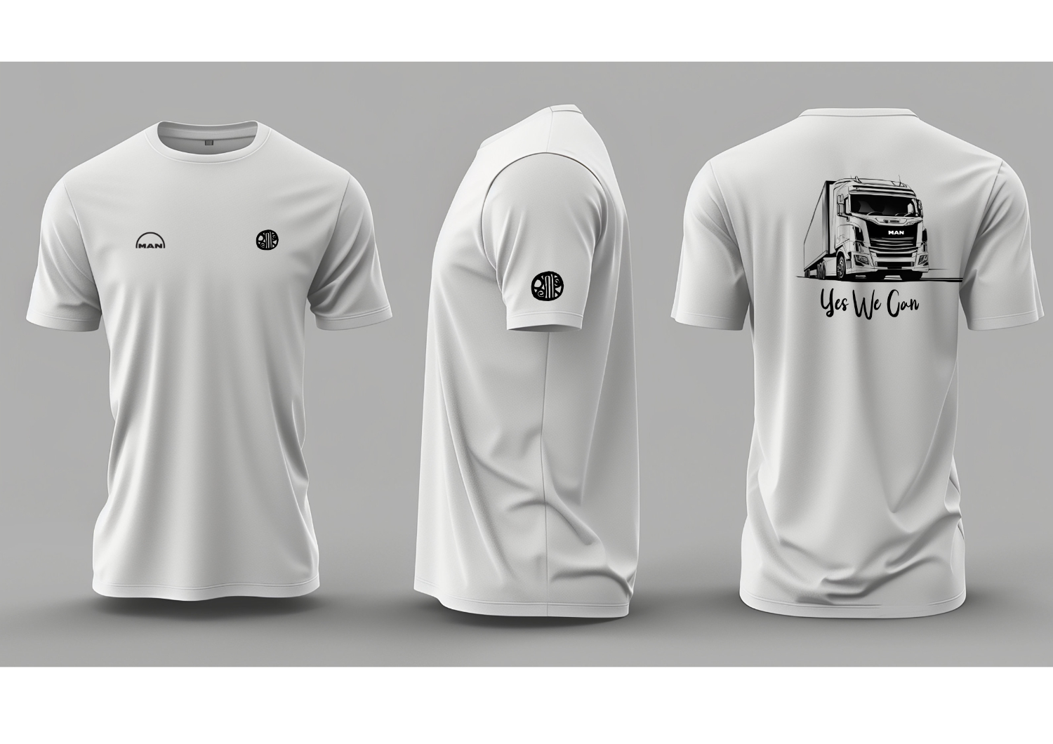
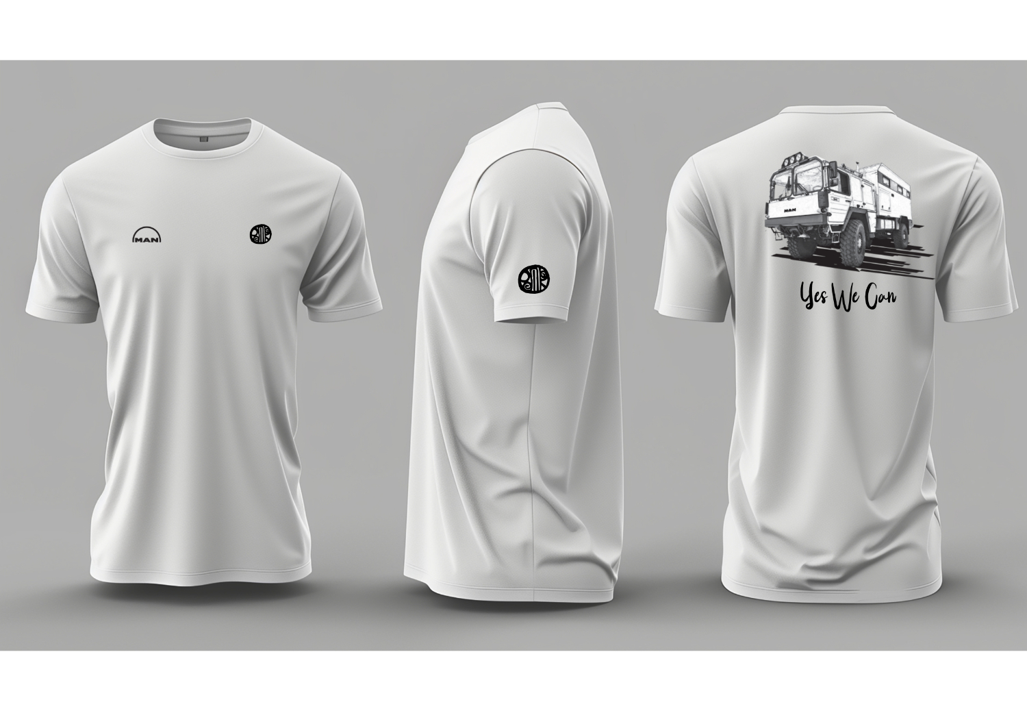
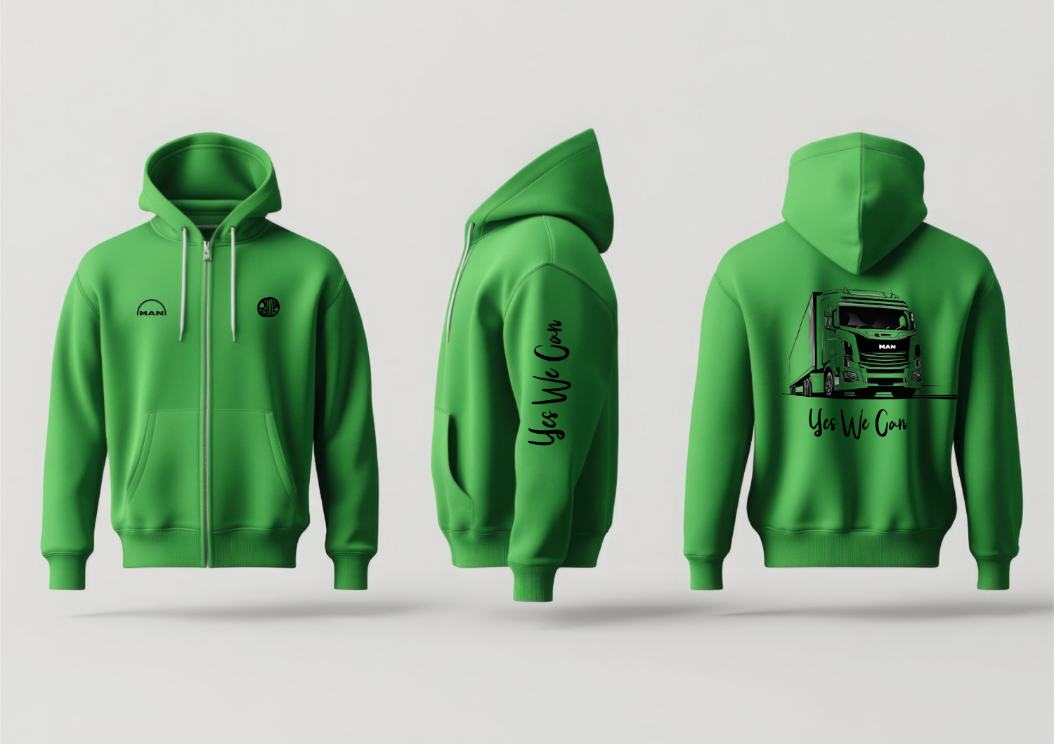
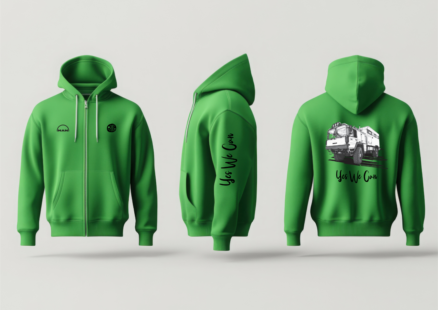
MAN Trucks Desert Tour
MAN Trucks, a global leader in heavy-duty vehicle manufacturing, commissioned a bespoke apparel line to accompany their Desert Tour – a bold expedition showcasing the power, durability, and innovation of their vehicles in some of the harshest environments on earth. The mission: create a clothing line that performed under pressure, reflected the tour’s grit and grandeur, and carried the iconic MAN identity into the world of wearable brand storytelling.
Design Approach: Function Meets Fashion: Outfits were built for survival, engineered using moisture-wicking, UV-protective, and sand-resistant fabrics—blending practicality with a rugged, stylish silhouette that echoed the MAN design DNA. Aesthetic Precision: Inspired by desert landscapes and mechanical precision, the color palette featured sandstone neutrals, steel greys, and bold red accents—a nod to MAN’s unmistakable brand colours. Utility Detailing: Designs included custom patches, reinforced seams, and multi-purpose pockets—perfectly attuned to both desert logistics and high-impact brand presence. Immersive Branding: Each garment told part of the MAN Desert Tour story—through symbolism, typography, and utility—increasing emotional engagement while maintaining industrial elegance.
The Desert Tour clothing line became more than just apparel—it became a uniform of endurance, a badge of experience, and a wearable extension of the MAN legacy. It united drivers, engineers, and crew under one strong, dynamic identity, leaving a lasting impression at every stop across the sand-blasted horizon.
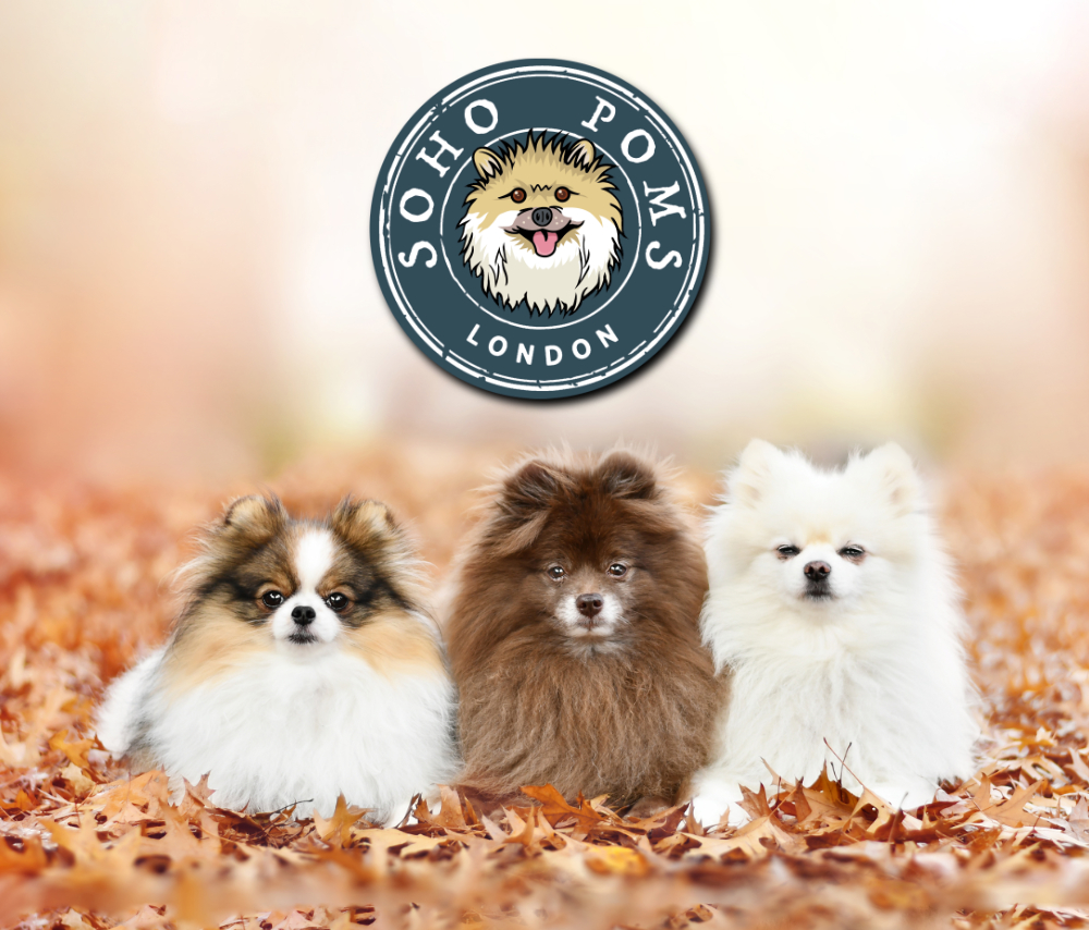
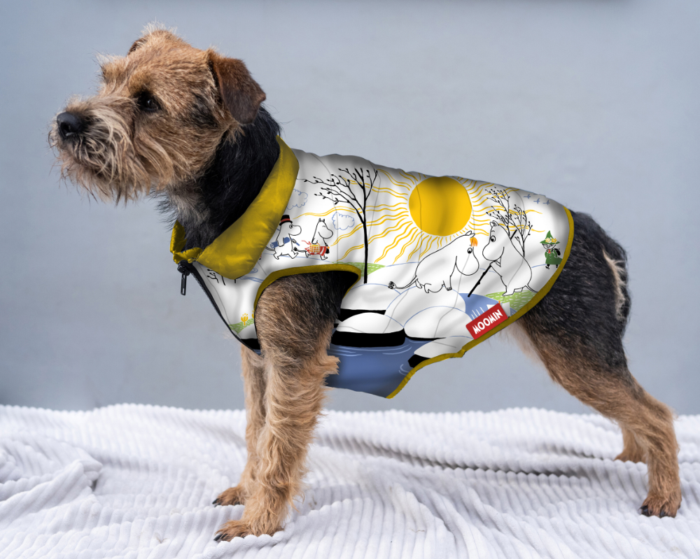
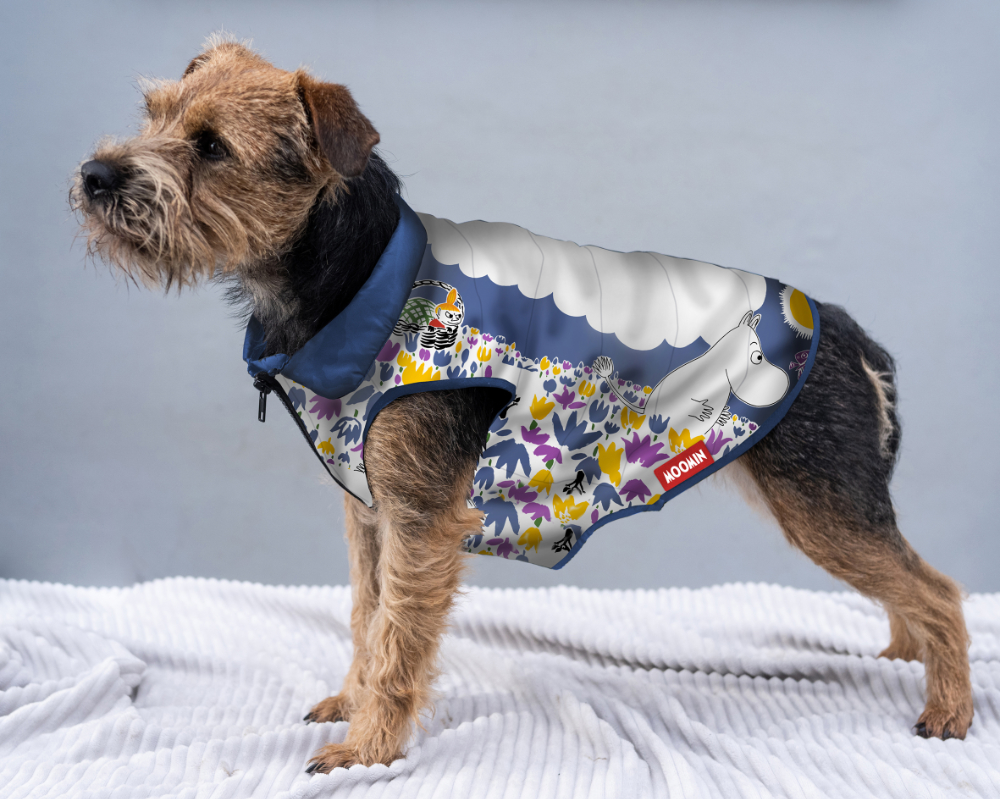
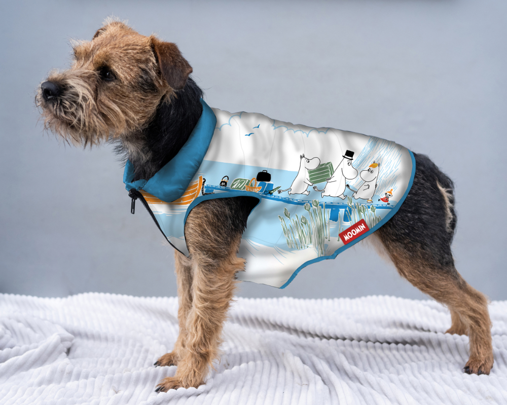
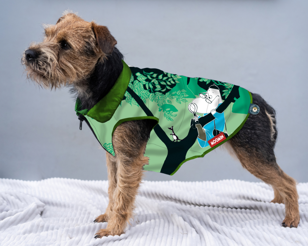
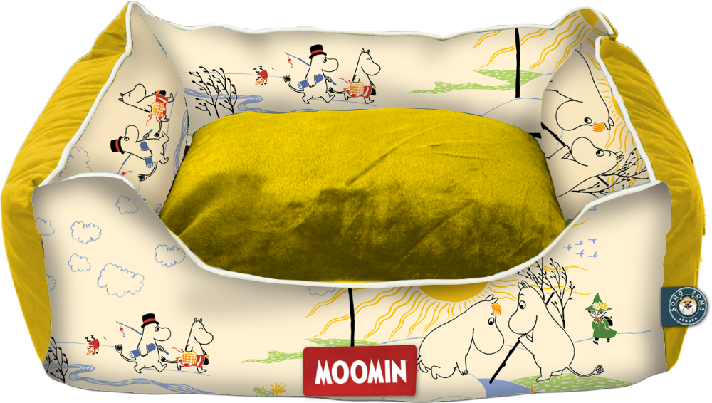
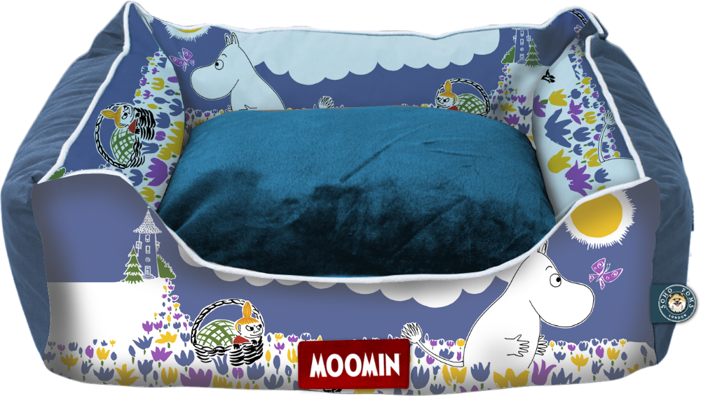
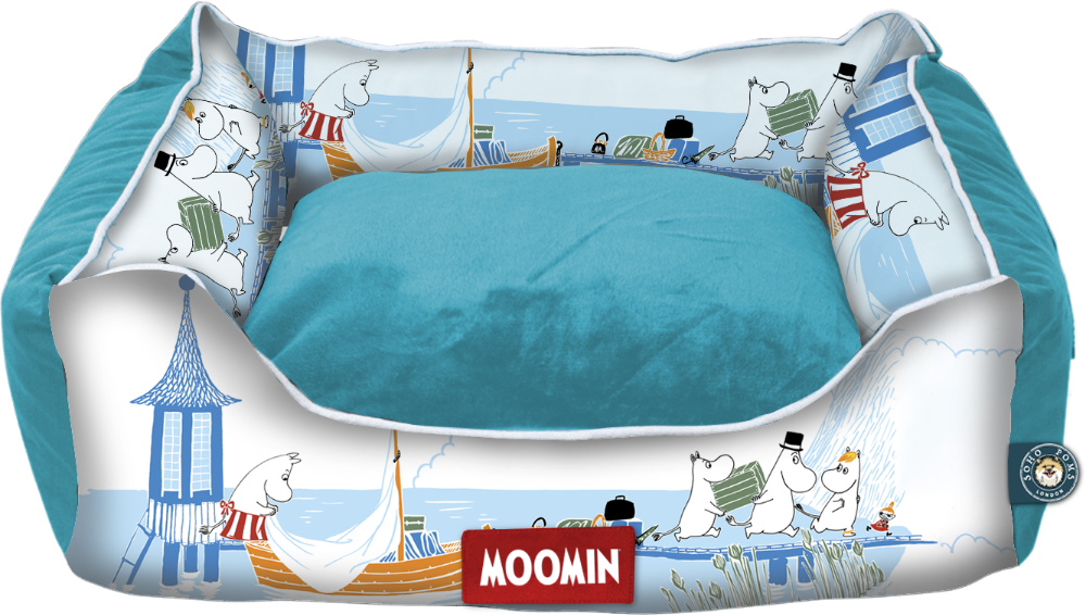
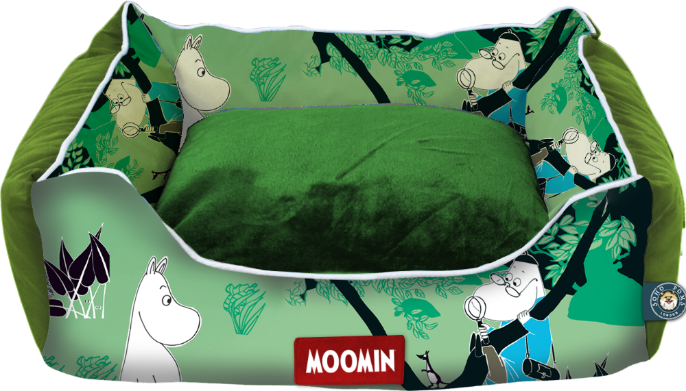
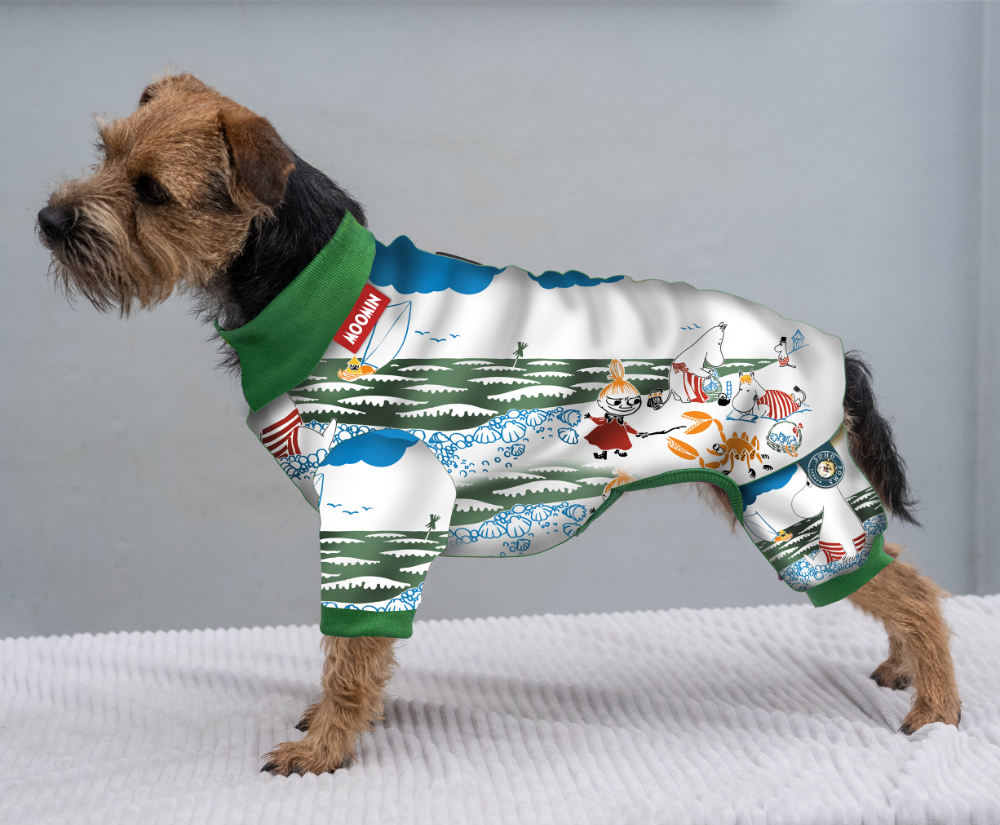
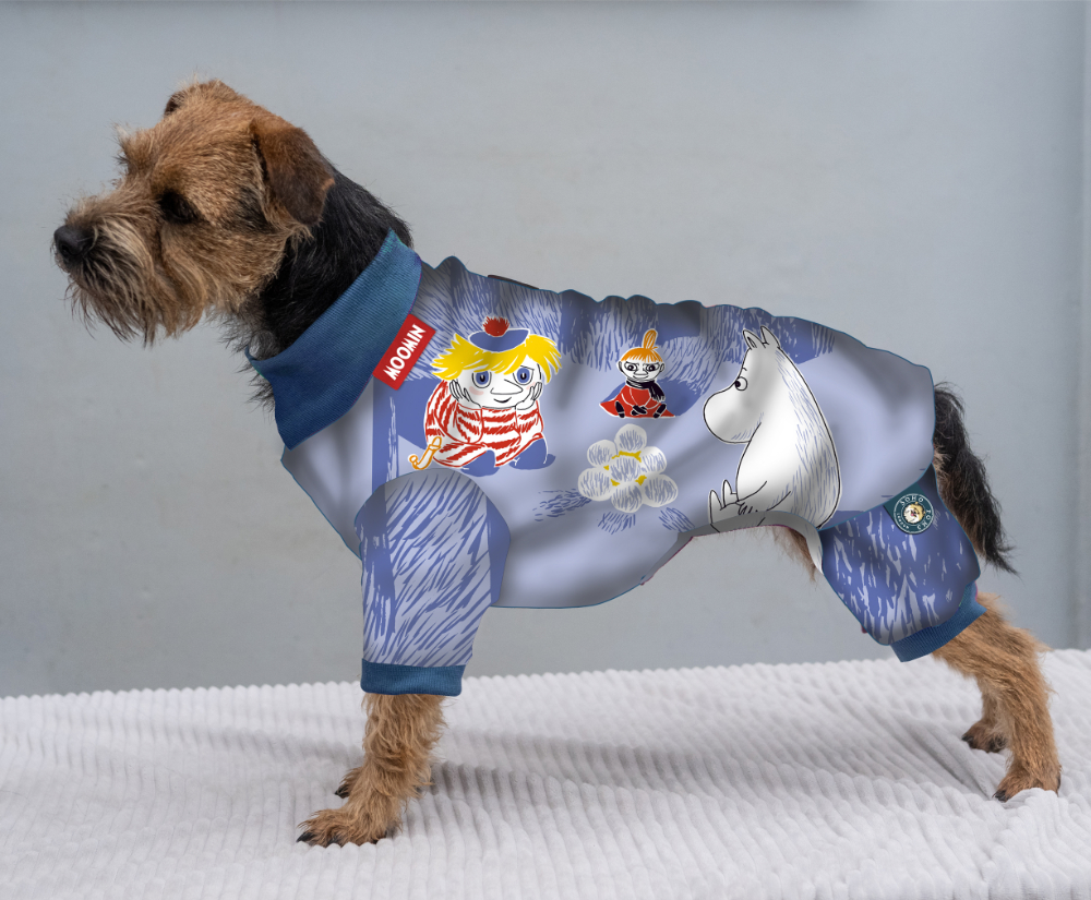
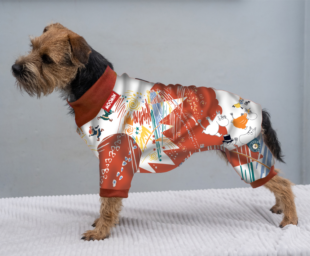
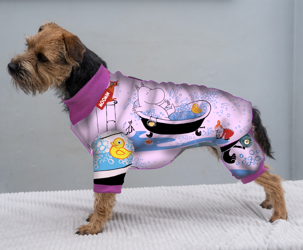
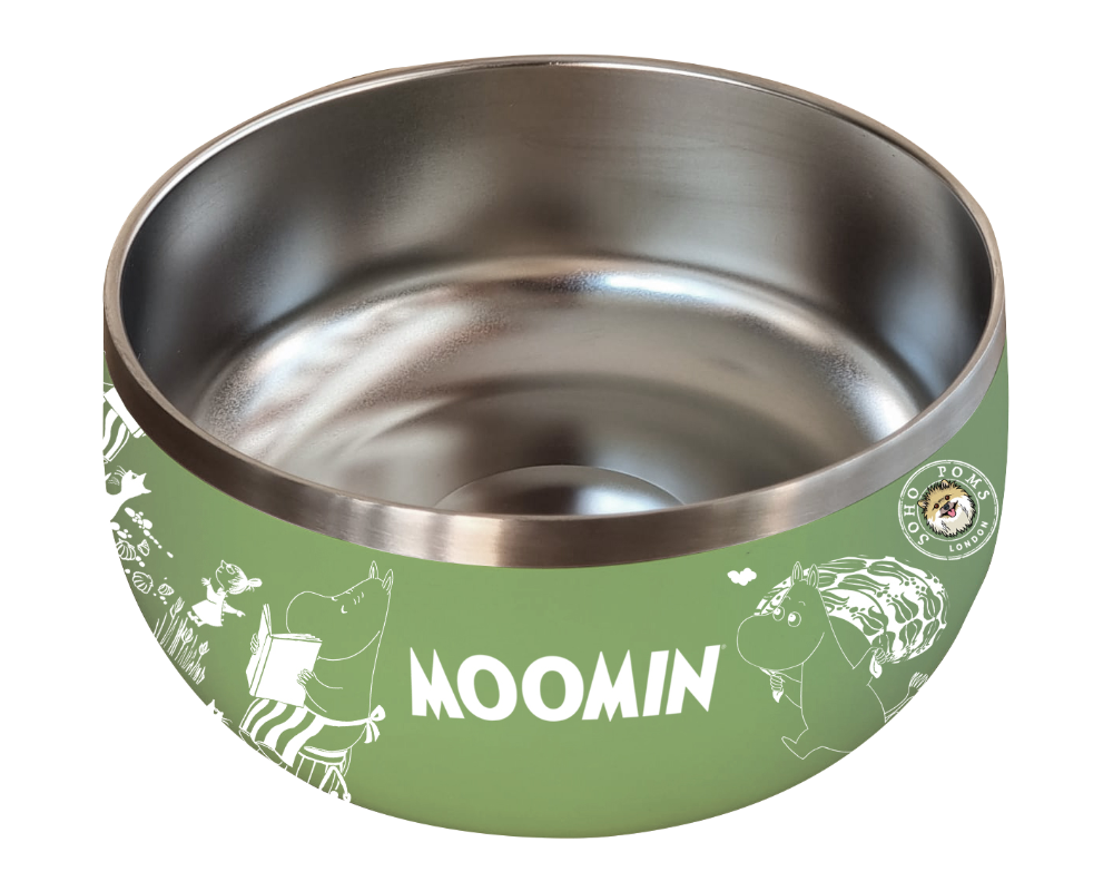
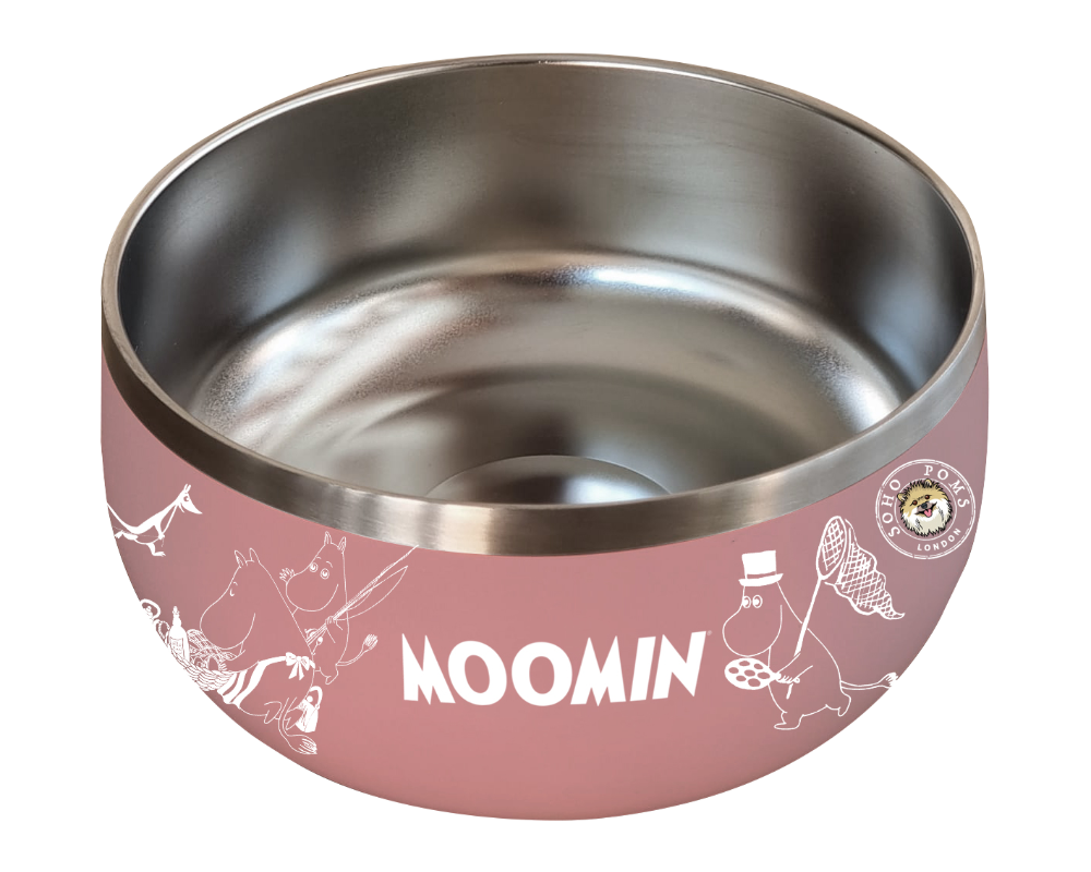
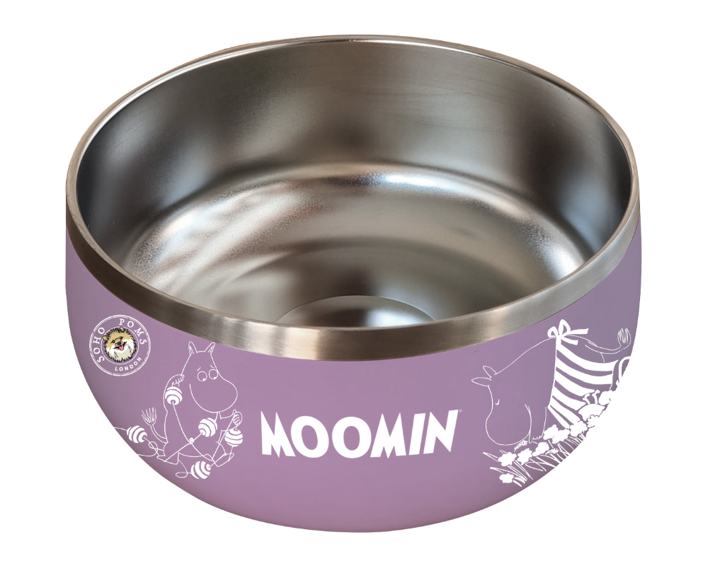
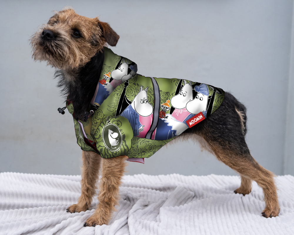
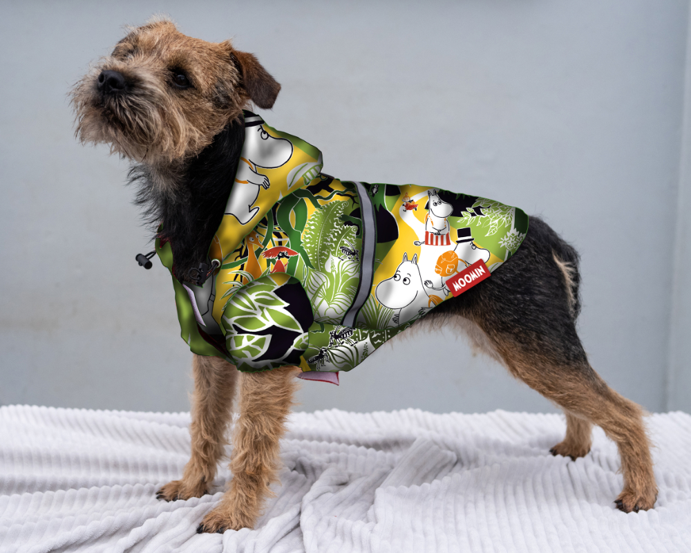
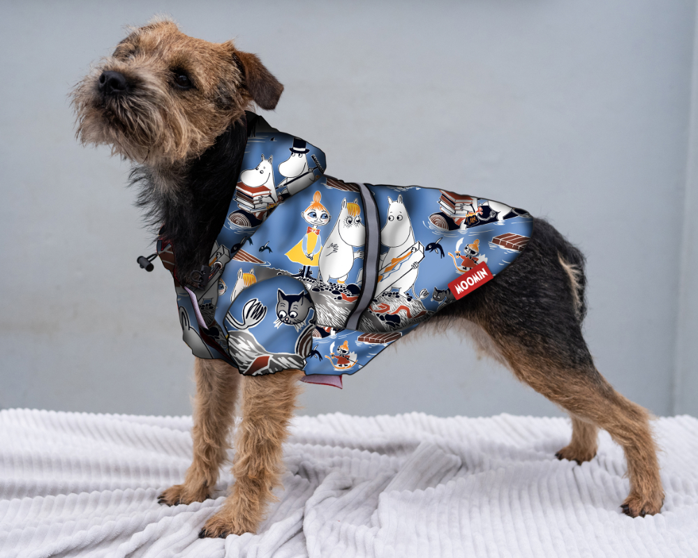
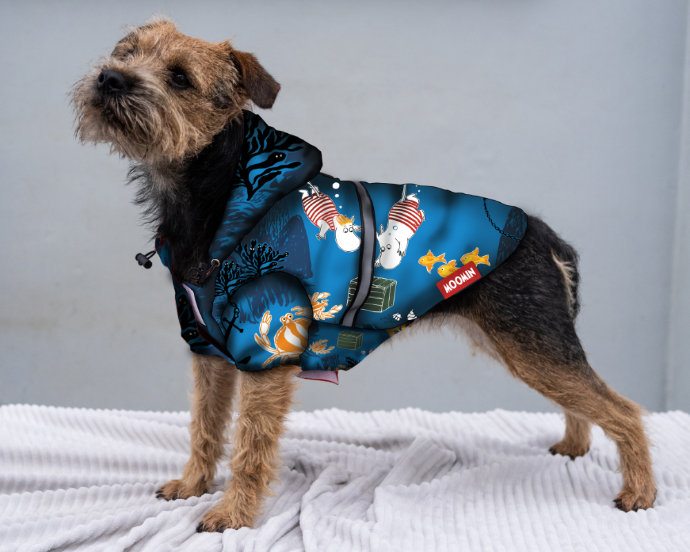
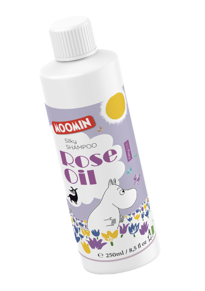
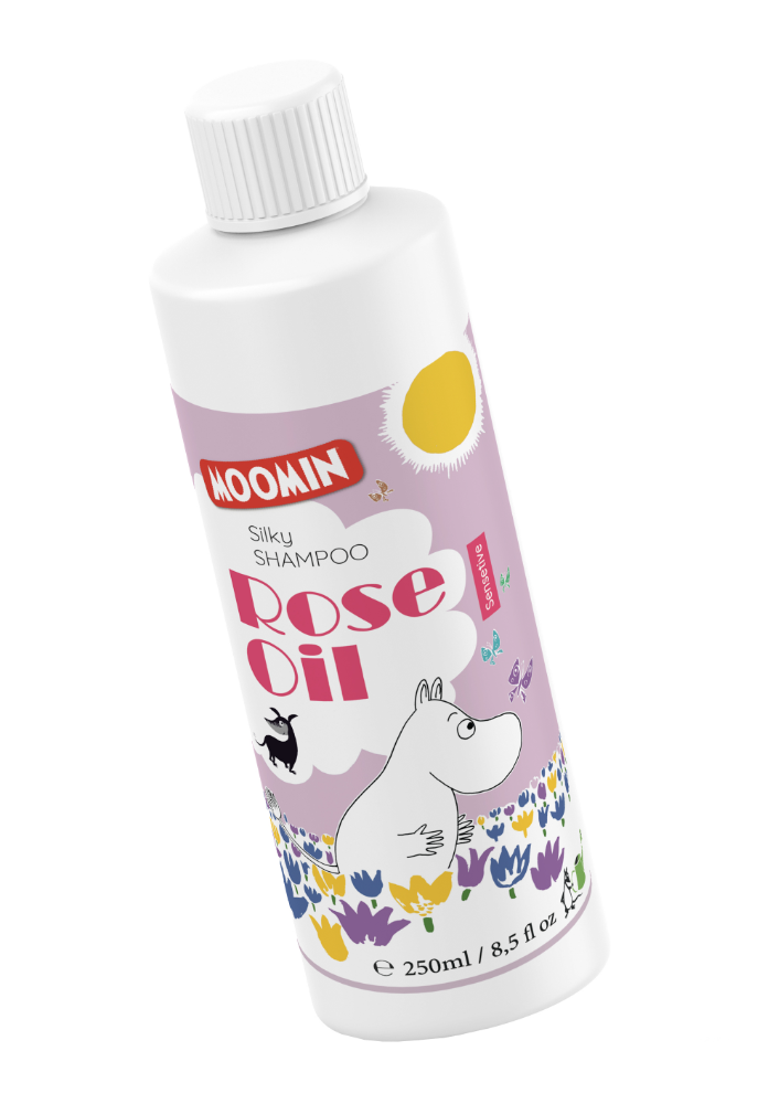
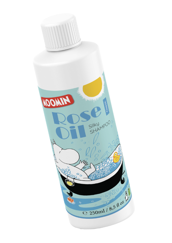
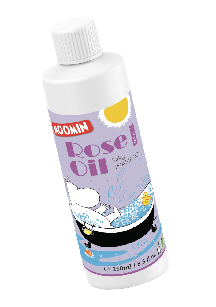
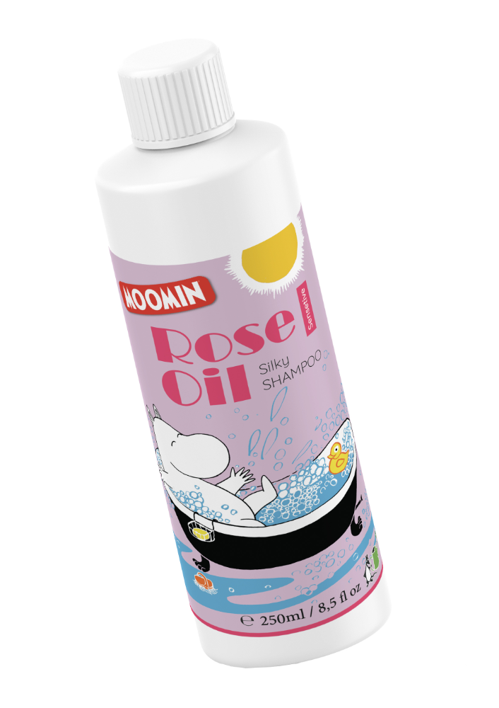
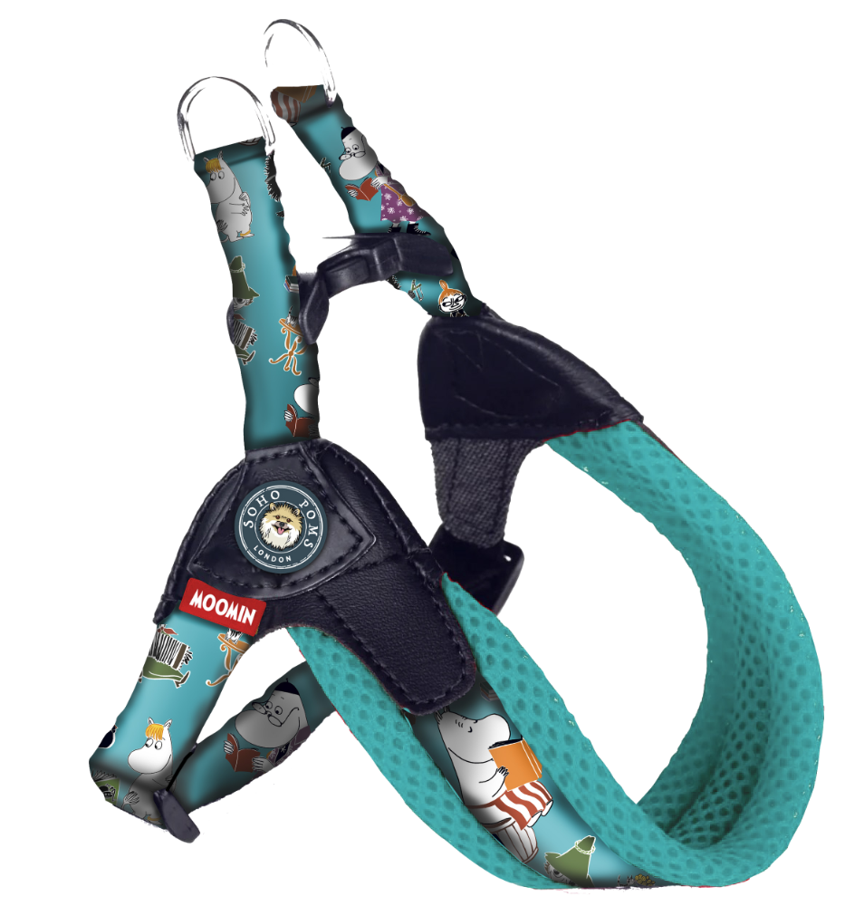
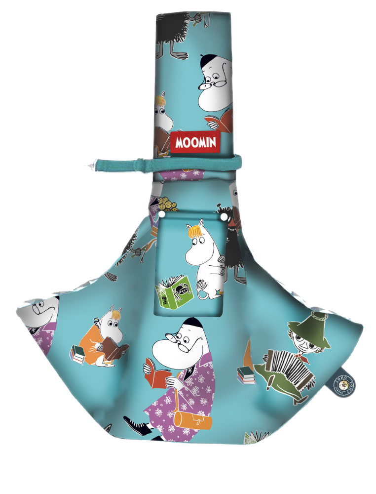
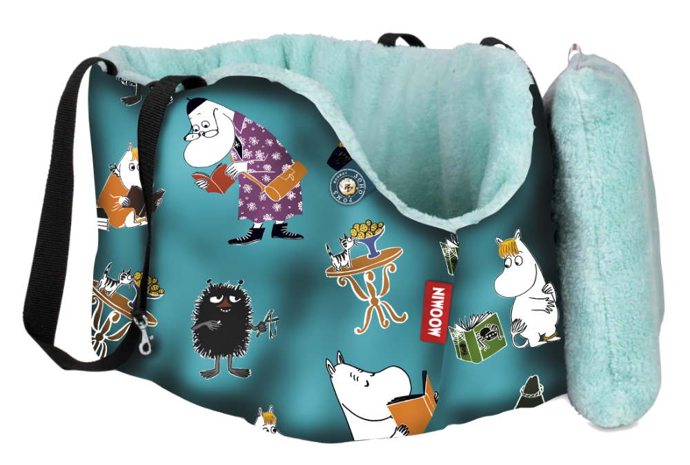
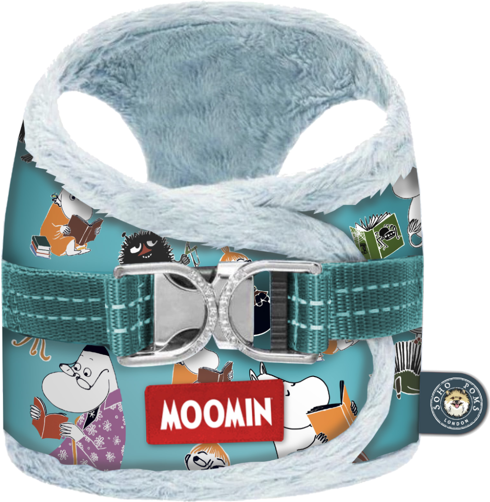
Moomins Pet Paraphanalia
In collaboration with Soho Poms London, a luxury pet accessories brand renowned for its stylish offerings tailored for Pomeranians and other small breeds, we embarked on a project to develop a unique line of pet accessories inspired by the beloved Moomin characters created by Finnish artist Tove Jansson. The objective was to merge the whimsical charm of the Moomins with Soho Poms’ commitment to luxury and quality, resulting in a collection that appeals to both pet owners and design enthusiasts.
Drawing inspiration from the enchanting world of Moominvalley, the designs incorporate playful motifs and illustrations that capture the essence of the Moomin characters, bringing a sense of nostalgia and joy to pet accessories. Maintaining Soho Poms’ standard for luxury, the products are crafted using high-quality materials, ensuring durability and comfort for pets while reflecting the brand’s sophisticated image.
Each item in the collection, from collars and leashes to beds and toys, is thoughtfully designed to meet the practical needs of pets and their owners, without compromising on style. The resulting collection offers a harmonious blend of functionality and fantasy, providing pet owners with accessories that are both practical and delightfully whimsical. This collaboration not only celebrates the timeless appeal of the Moomins but also reinforces Soho Poms’ position as a leader in luxury pet accessories.